
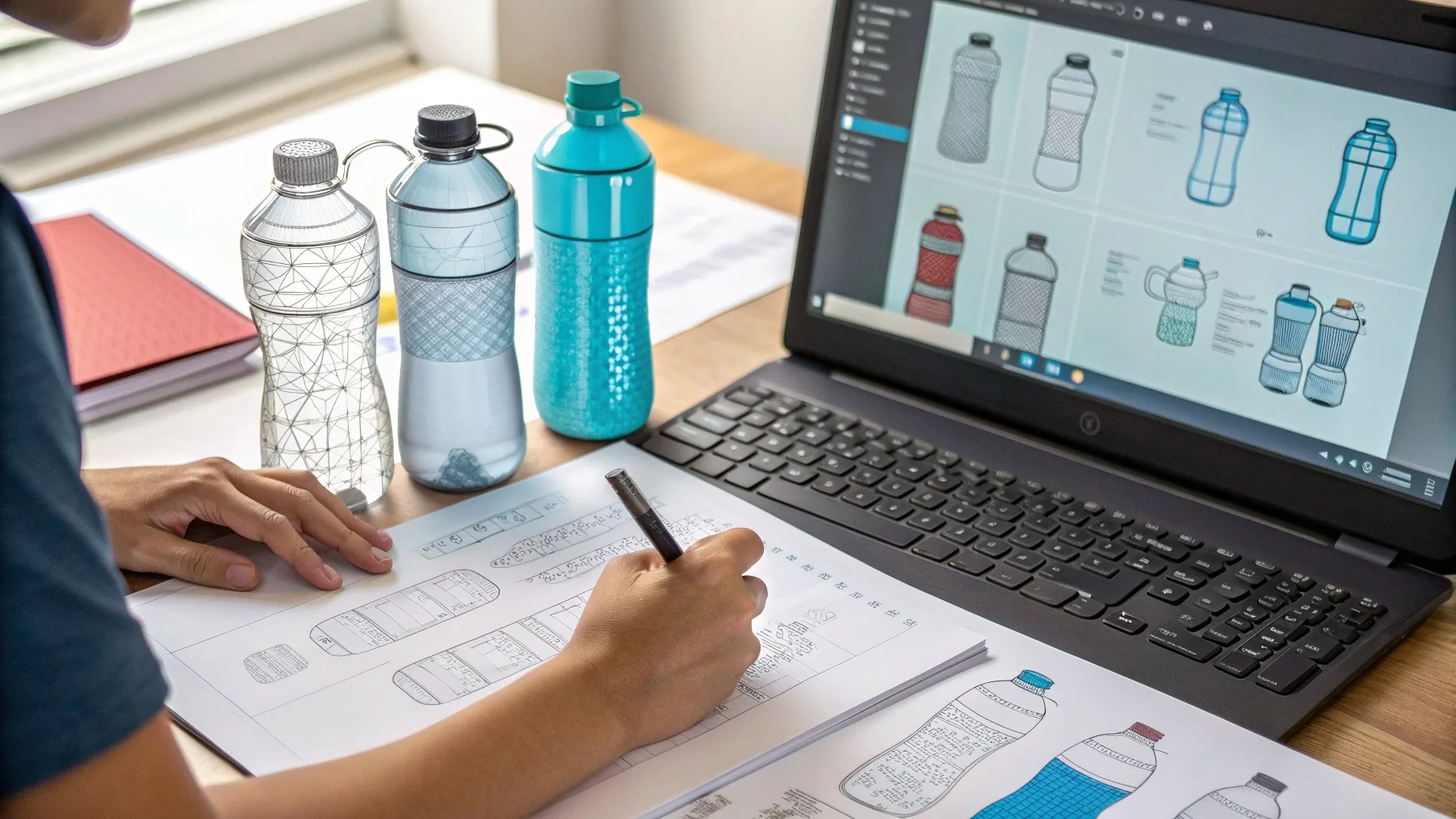
When I first created custom messages for plastic water bottles1, I faced many uncertainties—unclear font choices, sizing issues, and illegible designs. These mistakes cost me time and money.
The best practices for designing custom bottle messages include choosing readable fonts2, respecting size limitations, ensuring legibility, and carefully balancing multiple messages or designs. Clear guidelines simplify these decisions.
I learned from trial and error. Let me share practical tips so your custom messages stand out clearly and impress your audience.
What are the best practices for designing a custom water bottle message?
When I first tried designing bottle messages, I didn’t know what worked. Complicated designs and unclear fonts made my bottles ineffective.
Best practices include choosing clear fonts, keeping messages short and impactful, using contrasting colors, and considering the bottle's shape. Simple and direct designs always work best.
Practical Design Tips
| Best Practice | Why It Matters |
|---|---|
| Short Message | Easy to read quickly |
| Clear Fonts | Improves readability |
| Contrast Colors | Enhances visibility |
| Message Placement | Ensure maximum visibility |
My Design Experience
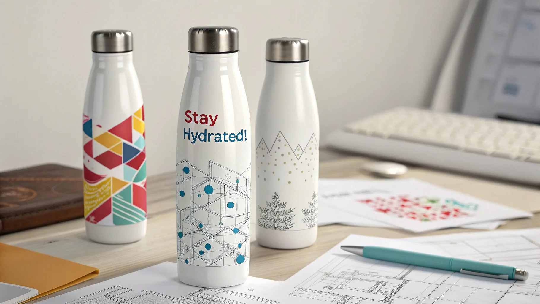
I found short motivational phrases in clear fonts were highly effective. Simple messages like "Stay Hydrated!" resonated immediately and clearly with clients.
Can I use any type of font for my custom water bottle message?
Initially, I tried fancy fonts, which led to readability issues. I learned quickly to simplify font choices.
Not all fonts are suitable. It's best to choose clean, sans-serif fonts like Helvetica or Arial for clarity. Avoid overly decorative or script fonts to ensure easy readability.
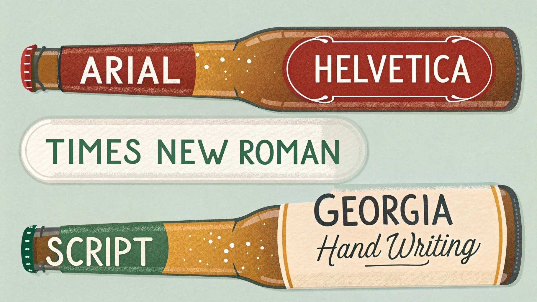
Recommended Font Types
| Font Style | Examples | Suitable for Bottles |
|---|---|---|
| Sans-serif | Arial, Helvetica | Highly recommended |
| Serif | Times New Roman, Georgia | Moderate clarity |
| Decorative | Script, handwriting fonts | Usually not recommended |
My Font Selection Mistake
I once chose a script font for a promotional bottle. Customers struggled to read the message, and the campaign flopped. Now I always prioritize readability first.
Are there any size restrictions for the message on a custom water bottle3?
Early on, I underestimated size limitations. Oversized messages looked crowded and unprofessional. Clear size guidelines changed everything.
Typical size restrictions depend on bottle dimensions but usually range from 2 to 4 inches wide and 1 to 3 inches tall. Always consult suppliers' templates or guidelines to avoid mistakes.
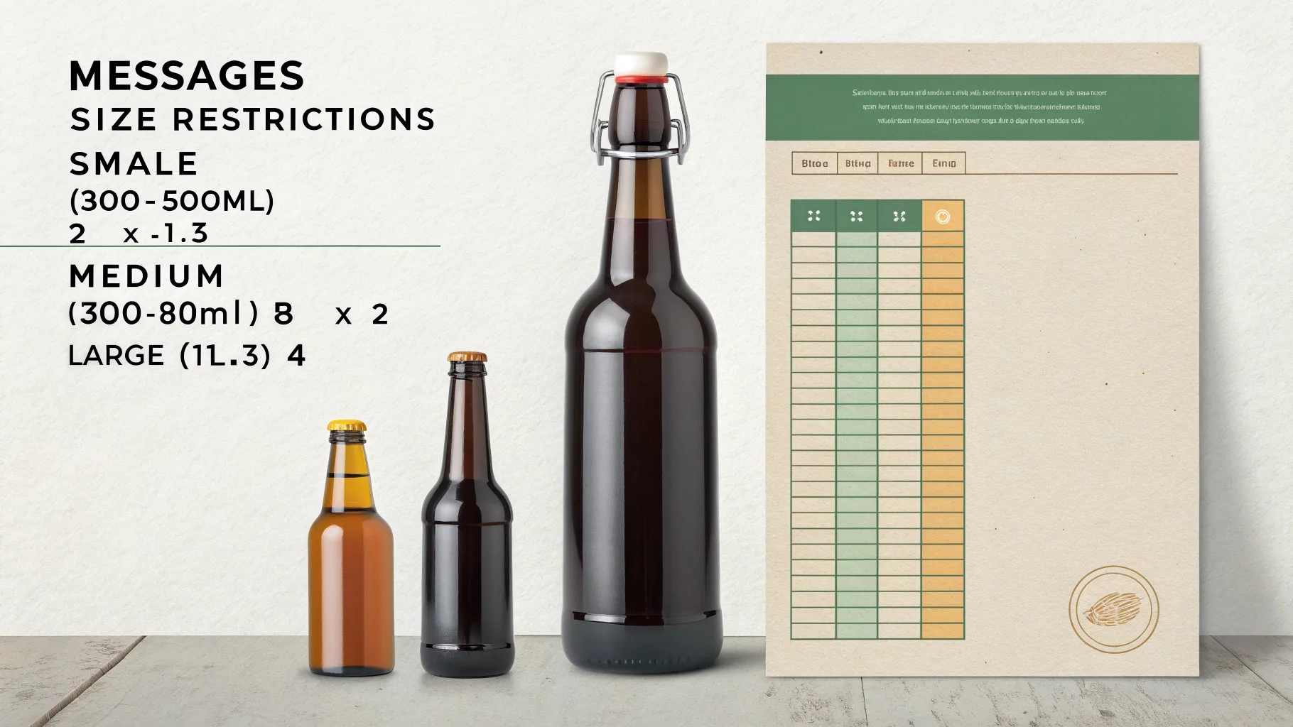
Typical Size Guidelines
| Bottle Size | Recommended Message Size |
|---|---|
| Small (300-500ml) | 2" x 1.5" |
| Medium (600-800ml) | 3" x 2" |
| Large (1L+) | 4" x 3" |
How Size Restrictions Improved My Designs
Adhering to clear size guidelines ensured messages were readable and professional-looking. Customers responded positively, and bottles clearly delivered their intended impact.
How do I ensure my custom water bottle message is legible?
I once created bottles with barely readable messages. Unclear designs were ineffective, and the entire order was disappointing.
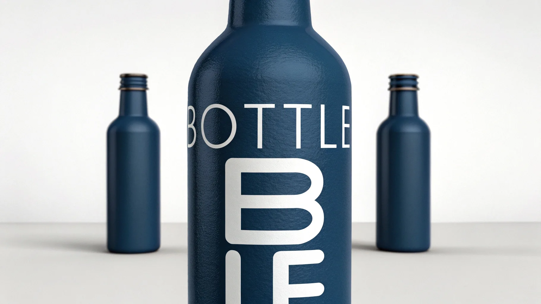
Ensure legibility by using high-contrast colors (e.g., white on dark blue), clear and large fonts, sufficient spacing between letters, and avoiding complicated graphics behind text.
Simple Legibility Tips
| Tip | How it Helps |
|---|---|
| High Contrast | Message stands out clearly |
| Clear Fonts | Quick readability |
| Proper Spacing | Prevents letters from blending |
| Minimal Background Graphics | Ensures text clarity |
My Legibility Success Story
When I switched to white text on dark-colored bottles, legibility improved significantly. Customers appreciated clear readability, and feedback was overwhelmingly positive.
Can I add multiple messages or designs to a single custom water bottle?
Initially, I thought more messages meant better marketing. Instead, multiple messages made bottles cluttered and confusing.
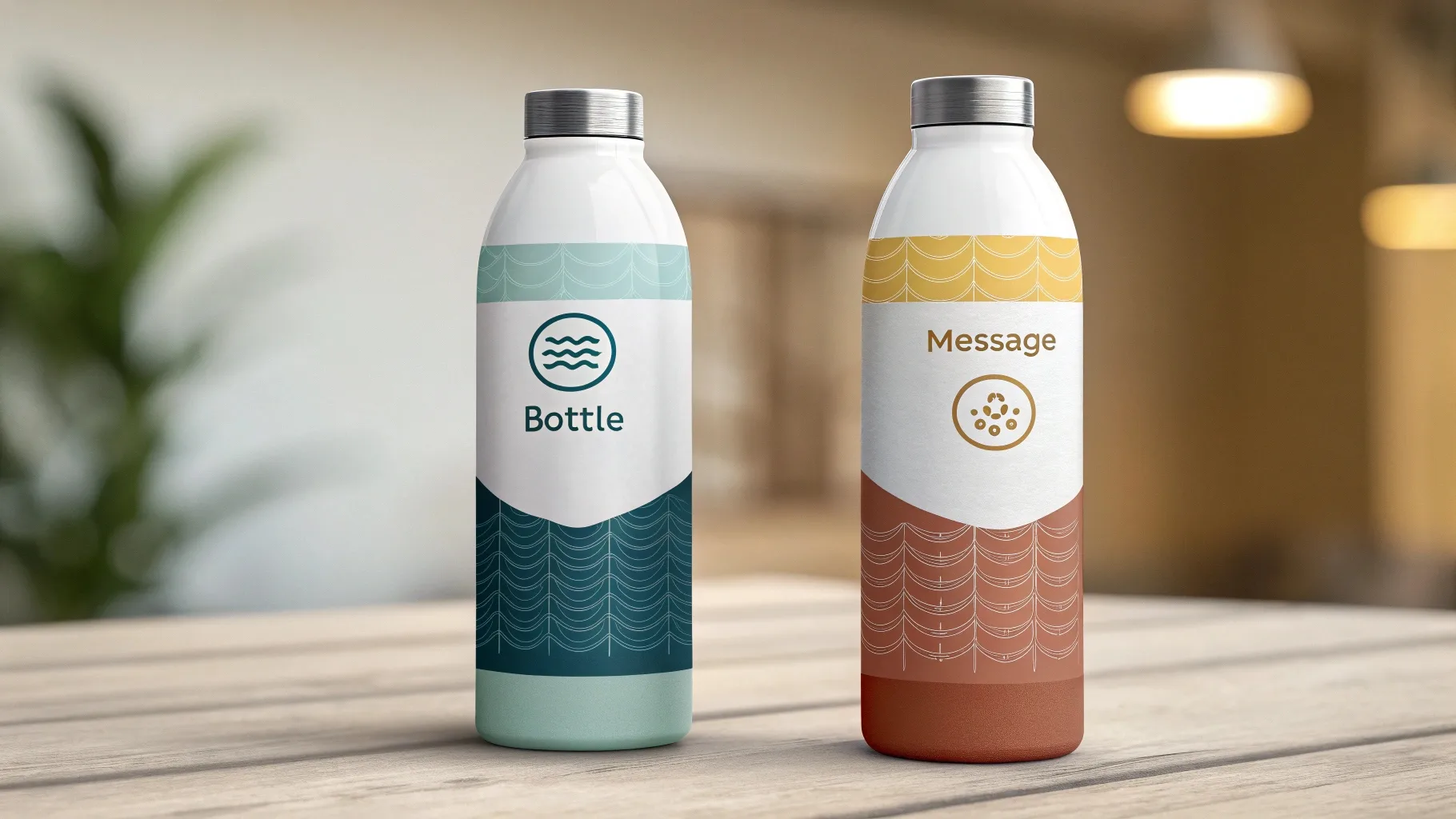
You can add multiple messages or designs, but limit them to two clearly separated areas—like front and back. Keep each message simple, and avoid cluttered designs for maximum impact.
Guidelines for Multiple Messages
| Recommended Approach | Benefits |
|---|---|
| Front/Back Separation | Clearly communicates each message |
| Short Text Only | Maintains readability |
| Different Colors | Clearly differentiates messages |
My Multiple Message Experience
I successfully used a front/back strategy—logo on one side, short motivational quote on the other. Clear separation ensured each message had impact, and clients loved the result.
Conclusion
Designing custom messages for premium plastic water bottles is simple when you clearly follow best practices—select readable fonts2, adhere to size guidelines, prioritize legibility, and strategically place multiple messages. These lessons dramatically improved my designs, increased customer satisfaction, and enhanced my brand image.
-
Explore this resource to learn effective strategies for designing impactful and clear messages on water bottles, ensuring your designs stand out. ↩
-
Understanding the significance of font readability can greatly enhance your design process and improve customer engagement. ↩ ↩
-
Discover essential guidelines for message sizing to ensure your designs are professional and effective, avoiding common pitfalls. ↩